


React Native 文本组件 Text
在 React Native 中如果要显示一段文本,可以使用 React Native 内置的文本组件 ``。
文本组件 Text 只能用来显示文本,如果要显示网页,可以使用网页组件 WebView。
虽然文本组件可能将部分文本显示为电话号码或者网址等可以点击的样子,但毕竟有限。没有 WebView 来的强大。
React Native 文本组件 Text
引入组件
使用文本组件 Text 之前先要引入它
import { Text } from 'react-native';
使用语法
<Text
   color="#333333"
   lineHeight="12"
   fontSize="12" >简单教程</Text>
属性说明
| 属性 | 类型 | 是否必填 | 说明 |
|---|---|---|---|
| selectable | bool | false | 是否可选中,true 为真,false 为否 |
| numberOfLines | number | false | 用于在计算文本布局(包括换行)后使用省略号截断文本,使得总行数不超过此数字 |
| ellipsizeMode | string | false | 如果设置了 numberOfLines,那么该属性用于设置文本如何被截断 |
| dataDetectorType | string | false | 用于设置如何转换文本中的某些子文本 |
| color | color | 否 | 用于设置文本的颜色 |
| fontFamily | string | 否 | 用于设置文本的字体 |
| fontSize | number | 否 | 用于设置文字的大小 |
| fontStyle | string | 否 | 用于设置文字是否倾斜,normal 正常,italic 倾斜,默认为 normal |
| fontWeight | string | 否 | 文字的粗细,可以设置的值有: 'normal', 'bold', '100', '200', '300', '400', '500', '600', '700', '800', '900' |
| lineHeight | number | 否 | 用于设置文本的行高 |
| textAlign | string | 否 | 用于设置文本的对其方式,可选的值有 'auto', 'left', 'right', 'center', 'justify'。Android 下只有 left 即使设置了其它值扔就是 left |
| textDecorationLine | string | 否 | 用于设置文本的下划线类型,可选的值有 'none', 'underline', 'line-through', 'underline line-through' |
| textShadowColor | color | 否 | 用于设置文本的阴影色 |
| textShadowOffset | object | 否 | 用于设置阴影的偏移量,格式为 {width: number,height: number} |
| textShadowRadius | number | 否 | 用于设置阴影的圆角度。 |
| letterSpacing | number | 否 | 用于设置字与字之间的距离 |
| textTransform | string | 否 | 用于设置文本转换格式,可选的值有 'none', 'uppercase', 'lowercase', 'capitalize' |
组件嵌套
文本组件 `` 可以嵌套另一个组件,被嵌套的组件会继承父级的文本组件的样式和属性。
<Text
   color="#333333"
   lineHeight="12"
   fontSize="12" >简单教程
      <Text
         fontSize="11"
         >简单编程</Text>
</Text>
范例
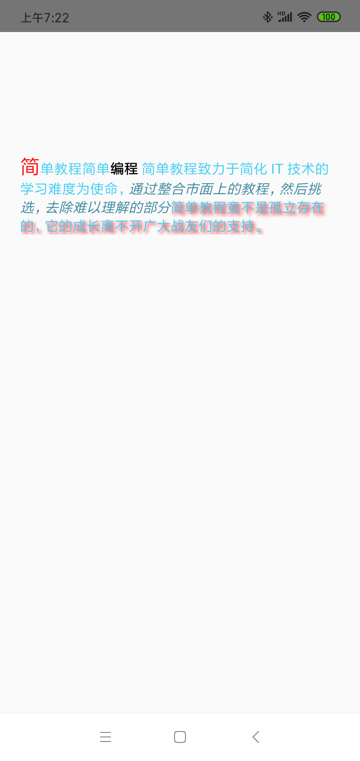
下面的代码,我们演示了 React Native 文本组件的用法,也演示了文本组件的嵌套语法。
import React, { Component } from 'react';
import { View, Text, Image, StyleSheet } from 'react-native'

const App = () => {
   return (
      <View style = {styles.container}>
         <Text style = {styles.text}>
            <Text style = {styles.capitalLetter}>
               简
            </Text>

            <Text>
               单教程
            </Text>

            <Text>
               简单<Text style = {styles.wordBold}>编程</Text> 简单教程致力于简化 IT 技术的学习难度为使命,
            </Text>

            <Text style = {styles.italicText}>通过整合市面上的教程,然后挑选,去除难以理解的部分
            </Text>

            <Text style = {styles.textShadow}>
               简单教程竟不是孤立存在的,它的成长离不开广大战友们的支持。
            </Text>
         </Text>
      </View>
   )
}
export default App

const styles = StyleSheet.create ({
   container: {
      alignItems: 'center',
      marginTop: 100,
      padding: 20
   },
   text: {
      color: '#41cdf4',
   },
   capitalLetter: {
      color: 'red',
      fontSize: 20
   },
   wordBold: {
      fontWeight: 'bold',
      color: 'black'
   },
   italicText: {
      color: '#37859b',
      fontStyle: 'italic'
   },
   textShadow: {
      textShadowColor: 'red',
      textShadowOffset: { width: 2, height: 2 },
      textShadowRadius : 5
   }
})
演示效果如下
评论区